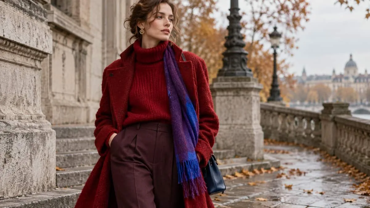

A red scarf thrown over a grey coat. A sweater tied at the waist to break up an otherwise neutral outfit. Red socks showing between well-worn loafers and the hem of a pair of trousers. It takes surprisingly little colour to change the balance of an entire look, which helps explain why red has held on to its status as fashion’s colour of the moment for several seasons.
But autumn 2026 suggests something more interesting than simple persistence. Red is no longer functioning only as the conspicuous accent that makes an outfit look current. After three consecutive seasons of visibility, it is beginning to behave more like a wardrobe anchor — something closer to black or camel than to a passing seasonal novelty.
For anyone interested in vintage, that distinction matters. A colour trend becomes much more useful when it allows us to look again at clothes we already own, or at pieces from previous decades, rather than simply telling us what to buy next.
Red has staying power
The short answer is yes: red remains a major colour for autumn 2026.
Across the Autumn/Winter 2025/26 collections, it appeared in rich and assertive shades, from deeper Winterberry to brighter Chili Oil and Poppy Red. The previous year, Milan Fashion Week had already made a strong case for red, ranging from vivid burgundy to vermilion. Valentino and Isabel Marant were among the names associated with that wave, while subsequent collections from Valentino, Versace and Isabel Marant continued to use red for outerwear and elegant dresses, sometimes giving winter dressing a sharper, rock-inflected edge.
Three consecutive seasons are enough to change the question. Instead of asking whether red is still fashionable, it becomes more useful to ask what role it can play in a wardrobe.
Vintage offers an obvious answer. An archival red coat, a tailored blazer or a burgundy leather bag does not suddenly become relevant because a runway has rediscovered its colour. What changes is the context around it. A piece that might have felt visually dominant a few seasons ago can now sit naturally within the broader palette of contemporary dressing.
That is one of the advantages of reading trends through vintage: fashion’s cycles become tools for reinterpretation rather than instructions for replacement.
Beyond red: burgundy, purple and electric blue
Red is not operating alone. Autumn 2026 also gives considerable space to burgundy, purple and electric blue, alongside quieter foundations such as chocolate brown, grey and cream.
The broader palette includes electric blue, red, purple, butter yellow, peach, turquoise and burgundy. Taken together, these colours suggest that cold-weather dressing no longer has to retreat automatically into muted shades.
Purple is particularly worth watching.
In its electric form, it appeared in bold looks from Gucci, Alexander McQueen and Miu Miu. Its glam-retro character also creates an immediate connection with 1980s vintage: pronounced shoulders, shiny fabrics and sculptural silhouettes can accommodate intense purple without making it feel like a decorative afterthought.
If one colour is likely to challenge red over the coming months, purple may be the stronger candidate. Klein blue remains a recognisable presence, but in the material available here it appears more firmly established in interior design, while intense purple has already demonstrated its ability to sustain a full runway season.
The useful question is not “Which colour should I buy?”
Seasonal colour reports tend to turn fashion into a shopping list. Red is in; buy red. Purple is next; find something purple.
That is the least interesting way to use colour information, especially with a vintage wardrobe.
A more practical approach comes from the colour wheel developed by New York label Tibi. It organises colour into four rings: black, neutrals, “no-color colors” in grey-brown shades, and brighter colours. The greater the distance between the colours selected on the wheel, the stronger and more deliberate the resulting contrast.
This framework becomes particularly useful when combined with the One / Ton / None styling method.
“One” means introducing a single point of colour into an outfit. A red scarf over a grey coat is enough.
“Ton” builds the look around several colours working together. Purple and electric-blue accessories against a neutral base can create that effect without requiring an entirely new wardrobe.
“None” removes strong colour altogether and works within neutrals.
There is no hierarchy between these choices. They simply produce different visual results.
That distinction turns colour from a trend to follow into a styling tool.
One / Ton / None works particularly well with vintage
Vintage wardrobes rarely behave like perfectly coordinated seasonal collections. They are usually assembled over time: a coat found years ago, a handbag from another decade, a pair of trousers discovered second-hand, knitwear kept because its colour or construction still works.
That apparent inconsistency can be an advantage.
A red scarf found at a market becomes the “one” against an archival grey coat. Purple and electric-blue accessories can form a “ton” over a quieter base. On another day, those same pieces can stay in the wardrobe while brown, cream, black or grey create a “none” look.
The method shifts attention away from the date of the garment and towards the relationship between pieces.
This also explains why a red garment bought last year — or found second-hand long before red returned to the runways — does not need replacing with the supposedly correct red of autumn 2026. Its usefulness depends on how it is placed within the outfit.
The season changes. The styling logic can remain.
A colour trend is more useful when it teaches us to look again
Closed lists of “must-have” colours are convenient for selling clothes because they give every season an apparent expiry date. They are less useful for getting dressed.
Red demonstrates the problem perfectly. If it had been treated purely as a temporary trend when it first returned, its continued presence would now require another explanation, another purchase and perhaps another shade. Instead, three seasons of red reveal how arbitrary that cycle can become.
The more useful lesson of autumn 2026 is therefore not that everyone needs red, purple or electric blue. It is that colour can be understood structurally.
A vintage red coat does not need permission from a new collection to become wearable again. A burgundy leather bag does not expire when another shade takes over the runway. An intense purple piece from the 1980s can move in and out of contemporary relevance without losing the characteristics that made it interesting in the first place.
Eventually, red will give way to something else. The colour wheel will keep turning.
A wardrobe built around understanding how colour works does not have to turn with it.
Join our Community: